Organise around how customers choose.
Collections, product attributes and search should reflect buying decisions. A kitchen-organisation shopper may browse by room or problem. A training-equipment shopper may begin with a goal. Product structure should make these choices understandable before adding promotional banners.
Make product information do useful work.
Dimensions, materials, suitability, delivery and returns information answer practical objections. Product photography needs to show the actual item. We plan the template around your catalogue and fulfilment model, including whether the purchase happens through checkout or a conversation.
- Collection and product page architecture
- Mobile product discovery
- Ordering and checkout integration planning
- Delivery and policy information placement
Choose the platform around operations.
Catalogue size, inventory ownership, payment methods and editing needs influence the technology. Integrations should support the way orders are fulfilled. Platform and payment-provider fees are considered before implementation; no technology choice is assumed from the visual design alone.
Inspect the whole buying journey.
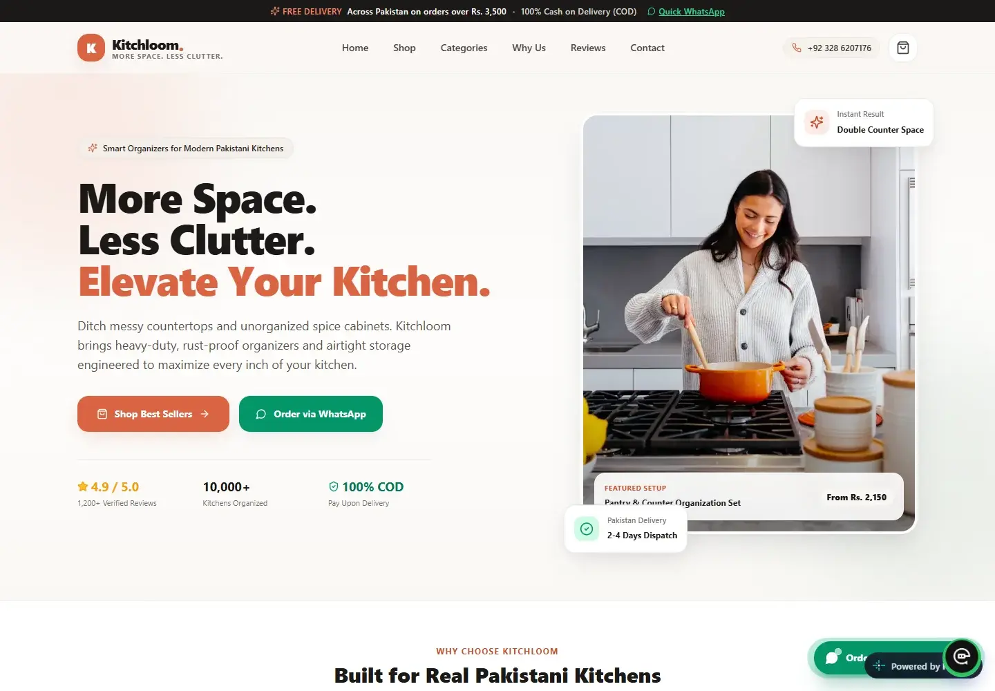
Test discovery, product selection, cart or enquiry actions, unavailable items and confirmation states. Check the experience on a real phone and verify what happens when a service fails. Kitchloom and FitGearHub provide examples of product-led work in the supplied portfolio.
Questions worth asking.
Can ordering happen through WhatsApp?
Yes, where that suits the business. Product context can be included in the message. A WhatsApp handoff is distinct from a completed payment or confirmed order.
Can you improve an existing store?
Yes. Start with the current catalogue, platform limitations and buying journey to identify whether focused improvements or a broader rebuild make sense.